.png)

The Challenge 🕰️
When your scheduling an appointment for the future feels like the past
At Oak Street Health, provider time was gold—but our scheduling tools were stuck in the stone age:
Basic tools that barely scratched the surface of patient needs
Welcome Coordinators juggling multiple systems
Transportation coordination that resembled air traffic control without radar
Schedule visibility about as clear as a foggy window
Patient preferences buried in notes like treasure without a map
The result? Wasted provider time, frustrated staff, and patients stuck in scheduling limbo.


My Role 🎨
Choreographing the scheduling dance as Design Lead
I stepped in as the scheduling maestro:
Led a design trio (myself, one UX designer, one UI designer)
Partnered with 6 engineers who turned our vision into reality
Owned research initiatives that uncovered the real scheduling pain points
Played diplomat between stakeholders with competing priorities
Held ground when "move fast" threatened to break essential things
End Users 👥
The Heroes Behind the Screens
Welcome Coordinators (WCs)
Scheduling Time Sink: Spent 5-7 minutes per patient booking appointments, severely limiting how many patients they could serve each day
System-Switching Nightmare: Constantly jumped between different systems for patient notes, preferences, scheduling, and transportation coordination
Transportation Chaos: Managed complex patient transportation using manual spreadsheets and endless phone calls to drivers
Invisible Provider Availability: Couldn't see multiple provider schedules at once, making it impossible to quickly spot available slots
Lost Patient Preferences: Critical patient needs (language, provider gender, time preferences) were buried in chart notes rather than built into the scheduling process
While welcome coordinators were the main user group we also considered Call Center Service Agents, Transitions care team members, Transportation leads and Practice Managers.
Methodology 🧭
Human-Centered Design Process

Starting with a kickoff workshop
Limited design sprint workshop over several days to determine shared vision
Ideated with 22 diverse users and executives to gain alignment
Everything done remotely

Honing in on the Vision 👁️
Build or Buy Decision
We used the original workshop to understand if scheduling was something that had to be built vs something we would make in house. The workshop was crucial in final alignment.

Iterations
Figuring out the flow was difficult in the first few versions. The first few iterations had too many steps at once. We also tried scheduling formats of our competitors but did not like how unclear it was to select time slots. We needed to do something different.


Sharing the Vision
By narrowing down the features, we were able to

Key Design Breakthroughs 🚀
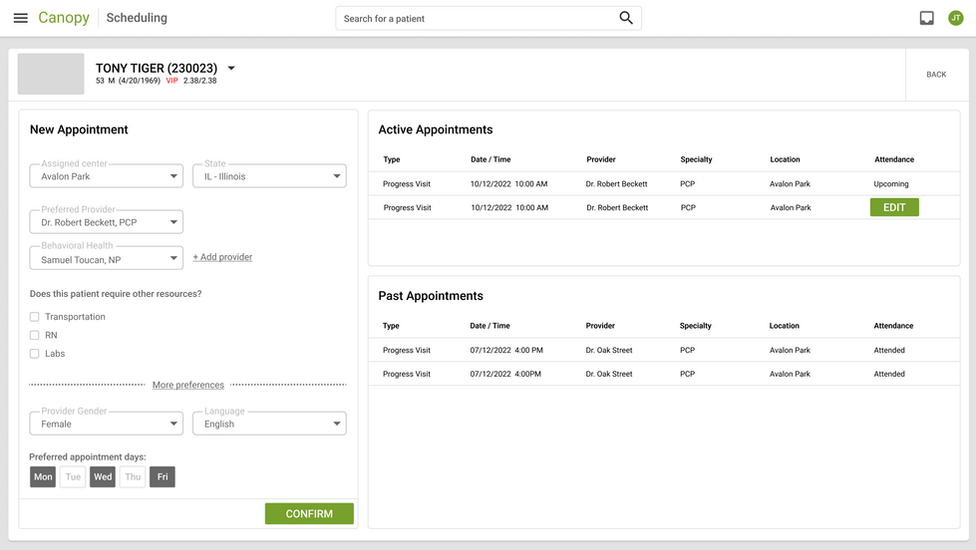
1. Patient Preference Powerhouse
Because patients aren't one-size-fits-all, and neither should their scheduling be
The Problem: Patient preferences were floating around in chart notes like unanchored ships, never making it into the actual scheduling workflow.
The Aha Moments:
Discovered some patients needed scheduling Tetris (urgent appointments + unavailable providers)
Learned patients have scheduling rhythms—some are morning birds, others afternoon folks
Found care teams naturally thought in AM/PM blocks, not hour-by-hour slots
The Solution:
Created a preference panel that remembered what patients needed
Treated location as a suggestion, not a rule (because patients roam!)
Built time preferences that matched how people actually think about their day
Made matching patients to providers feel less like blind dating and more like matchmaking

2. Transportation Coordination Magic
Turning the transportation tangle into a well-oiled machine
The Problem: Transportation scheduling was a spreadsheet nightmare that would make Excel experts weep.
The Discoveries:
Some patients needed rides every time, others just occasionally
Welcome Coordinators were spending more time as transportation dispatchers than schedulers
Nobody could see the full patient journey from pick-up to "the doctor will see you now"
The Solution:
Created a unified view showing provider time and transportation side-by-side
Built in transportation needs right into appointment details
Added conflict alerts before scheduling disasters could happen
Designed pick-up/drop-off visuals that made sense to actual humans

3. Clinic-Wide Scheduling Reimagined
Breaking free from the tyranny of traditional calendars
The Problem: No one could see the forest (clinic schedule) for the trees (individual appointments).
The Revelations:
Providers and vans were the twin pillars holding up the clinic day
Schedulers constantly compared schedules like they were solving complex puzzles
Care teams cared about both filling slots and keeping providers sane
The context around each appointment was crucial for smart scheduling
The Game-Changer:
Flipped the script with a horizontal view showing multiple providers at once
Added 3-day and 5-day toggle views to spot gaps at a glance
Focused transportation displays on what actually mattered: pick-ups and drop-offs
Created a scheduling command center that matched how schedulers actually think
Made schedule patterns pop visually so problems couldn't hide

Leadership Story 🕵️
Standing up for users when "faster" threatened to derail "better"
The MVP Showdown: When product wanted to ship without the clinic view (calling it an "MVP"), I channeled my inner advocate:
"Without the clinic view, we're asking users to bounce between systems like pinballs. That's not minimal—it's incomplete."
What Actually Happened:
Initial reception: "This looks great!" User adoption: crickets
Staff quietly slipped back to trusty old Greenway for the clinic view they needed
The experience became a powerful case study in what "viable" really means
This battle scar informed our approach to future projects, saving us from repeat mistakes
The Impact 📈
When design delivers more than just pretty screens
The Business Win:
Launched in less than 5 months (while vendor solutions were still filling out paperwork)
Saved millions in subscription fees that would have made vendors very happy
Built exactly what we needed, not what vendors thought we needed
Beat out fancy third-party solutions that promised the moon but delivered cheese
The User Victory:
Scheduling time plummeted from 5-7 minutes per patient to under 1 minute
Schedule visibility went from squinting to crystal clear
Transportation coordination transformed from nightmare to manageable
Patients got appointments that actually matched their needs and preferences
Lessons & Future Vision 🧠
What We Learned:
In healthcare, context isn't just king—it's the whole royal family
Fighting for essential functionality pays off in the long run
Sometimes the best solution is the one you build yourself
Always, always design for how users actually think, not how you think they should think
What's Next:
Tools for managing holidays and provider time-off that don't require a PhD
Seamless integration with out-of-office settings
A dashboard showing slot utilization that even executives can understand
Self-scheduling that doesn't make patients want to throw their devices
This project didn't just transform scheduling—it proved that deep user understanding plus the courage to advocate for what matters can create something truly game-changing in healthcare. No generic scheduling platform could have delivered this because they don't understand the complexity of healthcare scheduling. We do. And we built it.